
Close

Menu
M.H.
Overview
Full-cycle UX/UI design for Aestra — B2C aesthetic clinic offering anti-age programs, injectable treatments and laser procedures for a mid-to-high income audience.
Problem
Aesthetic clinics invest in ads and social media, but lose clients the moment they land on the website.
The goal
Design a website that converts visitors into booked consultations.
Every design decision was made to answer question: why should I trust this clinic enough to book right now?


Trust Gap
.01
Most clinic websites look either outdated or like a spa. Neither builds enough trust for a first-time client to book a medical procedure online
Medical Positioning
.02
Users can't tell the difference between a medical clinic and a beauty salon — so they default to price comparison instead of value
Booking Friction
.03
The site has no online booking. Users search for a contact, call, or DM and lose interest before they ever get to the clinic




.01
Blue was used to reinforce medical credibility and visual precision. Combined with white space, restrained UI and editorial photography, it differentiates AESTRA from warm, salon-like competitors while keeping the brand approachable.
.02
Oversized headlines communicate authority, confidence and clarity before users engage with detailed content. The first screen is designed to feel editorial, premium and medical rather than promotional.
.03
The experience starts with user concerns rather than procedures. Instead of browsing unfamiliar treatment names, users identify their own skin goals first, creating immediate relevance and lowering decision friction.
.04
A branded 3-step booking flow replaces a traditional contact form to reduce friction at the highest-intent moment.
Structured steps create clarity, perceived professionalism and a stronger sense of commitment.
.05
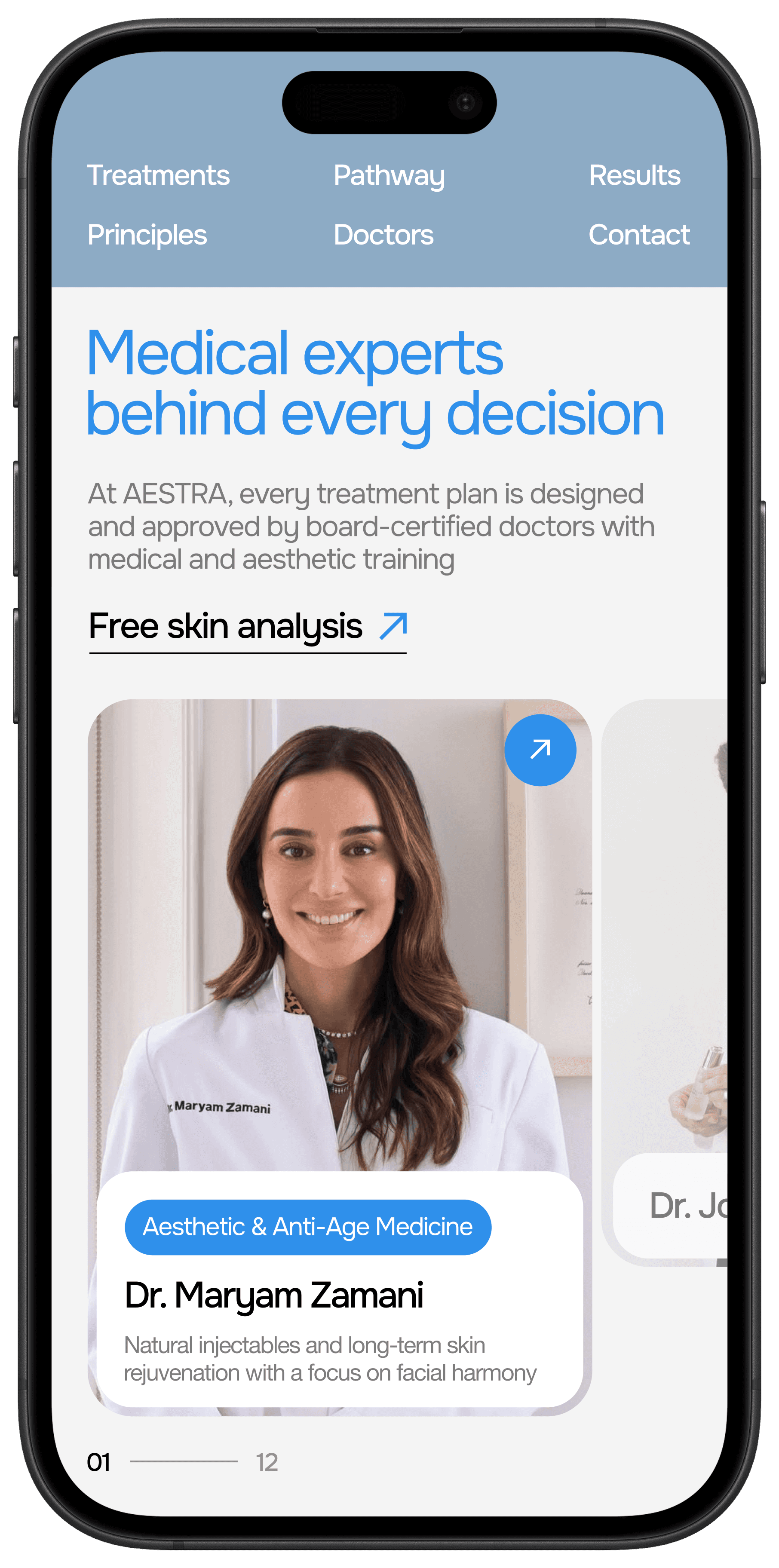
Doctor credentials, treatment protocols and safety standards are positioned as key conversion elements to reduce fear, uncertainty and hesitation before booking.
.06

Reflection
What I learned
Trust is a design problem. Before this project I thought conversion was about CTAs and booking flows — but the real blocker was emotional. Users don't leave because the button is hard to find. They leave because they don't feel safe enough to book a medical procedure with a stranger online. Every design decision that addressed fear performed better than every decision that addressed convenience.
What I would do differently
I would test the entry point earlier. The choice between "Book consultation" and "Free skin analysis" as the primary CTA was made intuitively — but this is exactly the kind of decision that should be validated with real users before going into final design. A short round of prototype testing at the research stage would have given this decision a stronger foundation.