
Close

Menu
M.H.
Overview
Sumly is an AI service that turns a meeting transcript into a structured summary: action items with owners, key decisions, open questions, in seconds. I designed the landing page for three audiences (PMs, design teams, founders) and worked through the full process, from concept to a working interactive site, using an AI agent as a design partner.
Problem
A landing page for an AI tool has one real job: make an invisible process feel real before the visitor commits to trying it. A static dashboard screenshot can't carry the speed of a messy transcript turning into structure. And a generic "we serve everyone" page loses each specific persona the moment they don't see themselves in it. The core challenge was closing the gap between "I don't know if this works for me" and actually watching it work on your own text.
01
Show the product before asking users to sign up
02
Help each audience recognize themselves within the first scroll
03
Reduce cognitive load through progressive disclosure
04
Support conversion at different levels of user intent

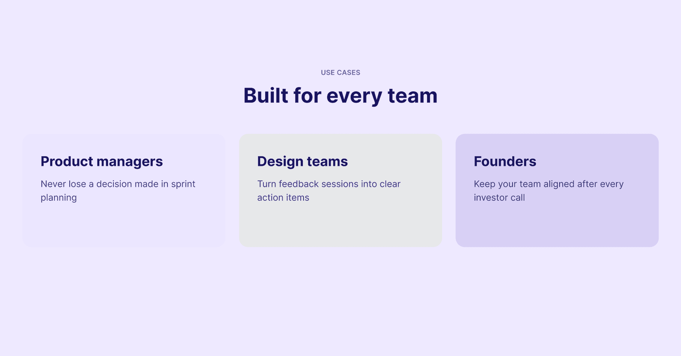
Initial concept
After several iterations
The biggest evolution throughout the design process happened in the Use Cases section.
It started as a simple three-card grid where Product Managers, Design Teams and Founders all shared the same layout and nearly identical content structure. Although the copy changed, every card looked and felt like the same feature presented three different ways, making it difficult for visitors to imagine how the product fit their own workflow.
Through several iterations, the section evolved into a tabbed experience where each persona received its own interface. Product Managers see metrics and follow-up tracking, Design Teams interact with component-linked feedback cards and Founders review a decision feed focused on strategic outcomes. Instead of changing only the messaging, the UI itself now reflects each audience's mental model.
Beyond making the product feel more relevant, the tabbed layout also reduces cognitive load by showing only one workflow at a time while keeping the other personas easily accessible.
Solution
Instead of relying on a static product screenshot, the hero lets visitors experience the product by pasting their own transcript. Throughout the page, CTAs appear at different stages of decision-making, allowing users to convert whenever they feel ready. The waitlist flow finishes with a self-closing success state, removing unnecessary interaction after submission.

Process
Built entirely with Figma AI Agent for structure and iteration, then Figma Make for the final build. Before anything hit the canvas, the agent and I mapped the scroll to the actual question a visitor asks at each point: how does this work, is this for me, what does it cost, what am I still unsure about. That sequence defined the section order. Design Teams' panel alone went through four failed directions (a components grid, a feedback stream, a kanban board, an annotations view) before landing on the final cards. With the agent handling execution, a wrong direction cost almost nothing, so we kept exploring longer than a solo pass would allow. First attempt: a vague export request to Figma Make, and the build was a mess: missing states, sloppy CSS. Took a rewrite with exact tokens and state machines, plus a couple of fixes, before it produced a properly wired React build.
Reflection
The real shift was in where the hours went, from placing elements to deciding what to build. Design judgment stayed mine: every "try again" was still my call and every UX decision (tabs over grid, multi-point CTAs, the self-closing modal) came from a specific assumption about visitor behavior, not from what simply looked good. Next time I'd settle the Use Cases direction with rough sketches before bringing the agent in on high-fidelity variants. Four full iterations at production quality cost more time than it needed to.